The story behind our logo
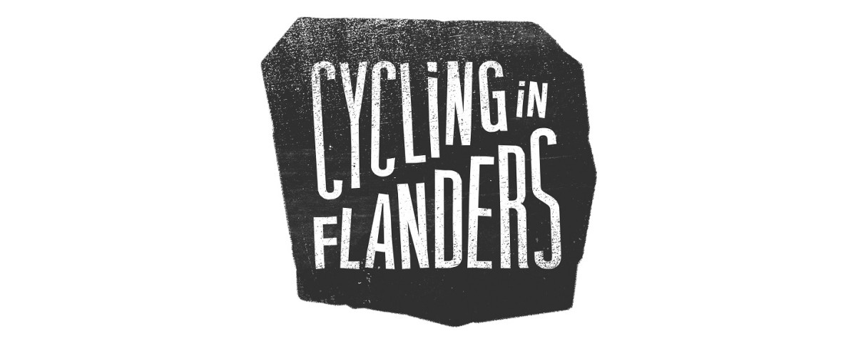
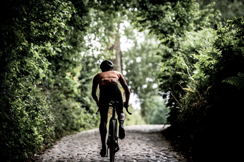
The Muur, the Koppenberg, the Paterberg... these are only a few of the legendary cobbled climbs where cycling history was written, where real Flandriens fought heroic battles in the Flemish classics and where every year thousands of cycling fanatics experience their moment of glory when they conquer these bergs & cobbles. The cobbled climb is what makes Flanders unique as a cycling country and that is what we wanted to reflect with the logo of 'Cycling in Flanders'.
We choose a rough quadrangle shape that can always vary slightly, just as no two cobblestones in Flanders are the same.
The diagonal line between the two words has a 22% slope, exactly the steepest part on the Koppenberg.
And the letters? Of course they are not perfectly straight. Anyone who has ridden on one of our cobbled roads will understand why.


